
What Coherence Principle #2 Is
Reference
According to Clark and Mayer (2011), excessive graphics used to merely "spice up" a lesson should be omitted. (Clark & Mayer, 2011, p.159) Many times educators have to search for graphic images to use with their lesson to enhance understanding. When choosing images it is also important to chose images that are not only relevant to the topic being instructed, but also be appropriate to the age group or audience of the learner. It would not be appropriate to use a graphic with details of an advanced level course in a beginner level learner. Often times, "simple level visuals provide a better understanding that an detailed visual". (Clark & Mayer, 2011, p.165)
According to Clark and Mayer (2011), excessive graphics used to merely "spice up" a lesson should be omitted. (Clark & Mayer, 2011, p.159) Many times educators have to search for graphic images to use with their lesson to enhance understanding. When choosing images it is also important to chose images that are not only relevant to the topic being instructed, but also be appropriate to the age group or audience of the learner. It would not be appropriate to use a graphic with details of an advanced level course in a beginner level learner. Often times, "simple level visuals provide a better understanding that an detailed visual". (Clark & Mayer, 2011, p.165)
How the Example Shows (or Doesn't) Coherence Principle #1
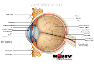
The below image is an example of a graphic image that would be used in a college level medical course teaching the parts of an eye; however, this same graphic would not be appropriate and contain too many details when teaching an elementary school level class of third graders on the parts of an eye.
 |
| Image Created by: rajeevkamal |
No comments:
Post a Comment