What Contiguity Principle #1 Is
According to Clark and Mayer (2011), placing printed words next to the part of the graphic that they describe or presenting spoken words at the same time as a corresponding graphic is known as the Contiguity Principle (Clark & Mayer, 2011, p. 92). He further states that if the text exceeds adequate spacing near the graphic then a pop-up window could utilized to open on a mouse roll-over for the user to see immediately. The proper placement of the words and graphics allow the user is able to use cognitive processing to accurately understand the intended message. In doing this, they are able to mentally organize the material into a meaningful learning process without having to divide their attention.
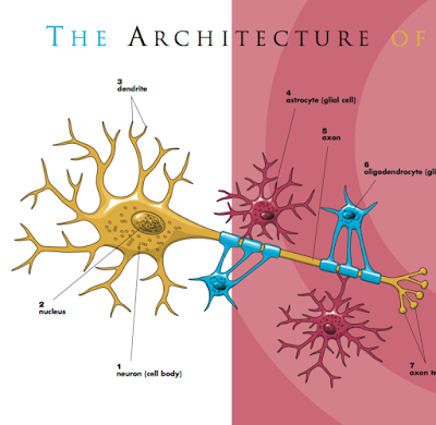
How the Example Shows (or Doesn't) Contiguity Principle #1
The image below, found on the education website:
www.ninds.nih.gov, shows an example of the contiguity principle because the textual wording of the architecture of the cell are physically placed near the corresponding graphic representing the text.
Reference
Clark, R. C., & Mayer, R. E. (2011). E-learning and the science of instruction: Proven guidelines for consumers and designers of multimedia learning. San Francisco: Pfeiffer

No comments:
Post a Comment